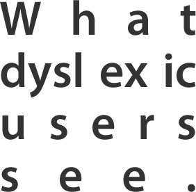
Web accessibility doesn’t only extend to colour blind users, but also dyslexic users.
Dyslexia is a perception or learning disability that impairs a person’s fluency or accuracy in reading, writing, and spelling. Web page designers can help dyslexic users read text more fluently and accurately by understanding and avoiding the bad design practices that hurt dyslexic users. Seeing things from their eyes can give them a better perspective on why accessible design is so important.
When dyslexic users read text, sometimes they can experience visual distortion effects. These effects vary in degree from person to person, but they can make reading text that much harder.
Below are six bad practices that are likely to cause these visual distortion effects for dyslexic users. Although these bad practices can also make reading difficult for non-dyslexic users, the effect they have on dyslexic users is much worse.
River effect
Dyslexic users may sometimes see the river effect in the text they’re reading. This is when large gaps occur within consecutive lines of text. It can often look like a river of whitespace flowing down the page, which can make reading fluently and accurately difficult. There are a couple bad practices that make the river effect happen.

1. Justified text
When you use justified text, you’re not only making text difficult to read for non-dyslexic users, but even more so for dyslexic users. Justified text creates large uneven spaces between letters and words. When these spaces line up above one another, a distracting river of whitespace prominently appears [4]. This can cause dyslexic readers to lose their place repeatedly. You can avoid creating the river effect by using left aligned text, instead of justified text for your paragraphs.
2. Double spacing after periods
Most of us were taught to double space after periods at the end of a sentence. This practice originates from the typewriting days of the past. Because typewriters used monospaced fonts, people thought that double spacing after periods would make the end of sentences more distinct. However, on the web, single spacing after periods are enough because most websites use proportionally spaced fonts. Double spacing after a period can create “rivers” within text that make it difficult for users to find the end of sentences. On the web, single spacing wins.
Blur effect
Another kind of visual distortion effect that can occur among dyslexic users is the blur effect. This is when dyslexic readers experience their text blurring or swirling or both together. This can significantly affect a dyslexic user’s reading ability, and make reading very tiring for them. You can lessen this effect by avoiding a couple of bad practices.

3. Pure black text on a pure white background
There’s a reason the text you’re reading now is not pure black (#000000), and the background that it’s on is not pure white (#FFFFFF). It’s because many dyslexic users are sensitive to the brightness of pure black text on a pure white background due to its high contrast. This can cause the words to swirl or blur together. To avoid this, use a slightly off-white color for your background, like a light gray. You can also use a dark gray for your text instead of a pure black to cut the glare even more.
4. Long blocks of unbroken paragraphs
Long blocks of unbroken paragraphs are hard for non-dyslexic users to read, but even harder for dyslexic readers. It’s easy for dyslexic readers to lose their place with long paragraphs. That’s why it’s better to use short paragraphs that express one idea. This is because dyslexic users need more breaks between ideas than non-dyslexic users. Breaking up your text to one idea per paragraph makes reading a lot easier for both dyslexic and non-dyslexic users.
Washout effect
Sometimes dyslexic users can experience the washout effect. When this happens, the text looks faint and indistinct. This can make reading slower and cause dyslexic users to guess what a word is because of the difficulty seeing it. To lessen this effect, there are two bad practices you should avoid with your text.

5. Serif fonts
Serif fonts have hooks at the ends of the letter strokes. They may look decorative, but they can cause reading problems for dyslexic users. Serifs tend to obscure the shapes of letters, making the letters run together. A sans-serif font would allow dyslexic users to see the shapes of letters more clearly because they don’t have hooks at the ends of the letter strokes. This also increases the spacing between letters, making words more distinguishable. If you want your users to read your text easily, go with a san-serif font.
6. Italicised text
Italics are sometimes used to highlight text. However, the reason you shouldn’t use italicized text is because they are hard to read. The letters have a slightly jagged line compared to non-italic fonts. The letters also lean over slightly making it hard for dyslexic users to read words accurately. When the text size is small, the text is practically illegible. A better way to highlight is to use bold text because the letters are clearer and give better contrast.
There are many dyslexic users that suffer from badly designed websites. All of these bad practices are quick and easy to fix. It’s a matter of knowledge and understanding that will get people to change. Hopefully, this article has shed some light on how dyslexic users experience the web, and what designers can do to make their reading experience better.
[Reference Sources]
1. http://www.angelfire.com/tn3/writing/DesignUsersReadDis.pdf
2. http://clearhelper.wordpress.com/2009/12/14/web-site-design-suggestions-for-people-with-dyslexsia
3. http://www.dyslexia-parent.com/mag35.html
4. http://www.pws-ltd.com/sections/articles/2009/justified_text.html
5. http://irlen.com.sg/irlen.html
6. http://accessites.org/site/2006/11/designing-for-dyslexics-part-3-of-3
7. http://www.bdadyslexia.org.uk/about-dyslexia/further-information/eyes-and-dyslexia.html
8. http://en.wikipedia.org/wiki/Justification_(typesetting)
9. http://en.wikipedia.org/wiki/Double_spacing_at_the_end_of_sentences


No comments:
Post a Comment